New image for the Coupe du Monde de la Pâtisserie

Author:
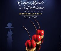
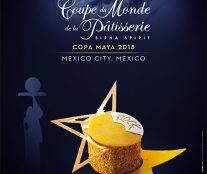
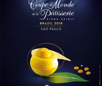
Ana RodríguezOn the occasion of its 30th anniversary, the Coupe du Monde de la Pâtisserie has decided to change its visual identity, which will be presented in four different versions: Final 2019, Brazil 2018, Mayan Cup 2018, and European Cup 2018.
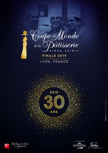 Some changes are evident at first glance. For example, the logo is no longer within a frame, which allows more freedom for graphic compositions. And the typography is the same, but it adopts the codes of luxury, enhanced with golden colors and dark blue.
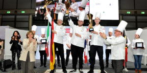
On the poster of the final, which is elegant and festive, the anniversary logo stands out wrapped in a burst of golden dust. In addition, by including the image of the winners in the background, they want to highlight the values that are intrinsically associated with the competition: excellence, passion, and team spirit. Meanwhile, emphasis is placed on pastry creations in the illustrations used for the national and continental selections.
The equivalent competition in terms of cuisine, the Bocuse d’Or, also opens its image for its 30 anniversary and does so with the sad news of the recent death of its organizer, the legendary Paul Bocuse at 91 years old. Its new visual identity is creative, energetic, very modern, and with Paul as the clear protagonist.
