Seven trends for patisserie packaging design in 2015
Author:
Luis ConcepciónThe experience of the crisis has greatly affected the purchasing and consumption habits of customers. Thus, austerity, cost containment, and elimination of superfluous elements are still seeping deep into some of the paradigms that are trends in the new packaging design in patisserie.
The packages presented here come from different parts of the world, but most have elements in common: simplicity, practicality, against artifice, and strongly influenced by the world of stationery. The nobility of cardboard, paper, envelopes, and the boxes inspired by the fountain pen cases are the order of the day. Chocolate remains the target of new designs which also try to distance themselves from the Aztec patterns and motifs which are usually associated with this product.
1. Chinese tradition turned into design
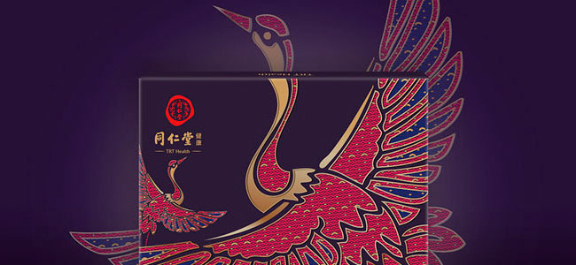
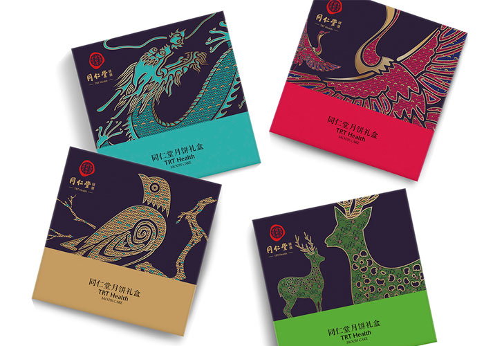
Design: Mon Shuihua, Sun Bo / Customer: TRT Health / Country: China
Happiness, prosperity and longevity. These are the most important aspects of Chinese culture that Lu Shuihua and Sun Bo used in the overall concept that inspired the design of the TRT Health Moon Cakes 2015. The TRT Health firm boasts 300 years of history, so they had to create a design deeply rooted in tradition, but at the same time not out of tune with current trends.
2. Cases and candies inspired by the landscape
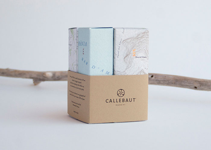
Design: Ingrid Picanyol / Client: Callebaut Brand / Country: Spain
Ingrid Picanyol’s design was born with the intention of surprising the Callebaut brand ambassadors, who came from around the world to Barcelona during the 2014 Barry Callebaut International Seminar. This case set contains four types of candies, inspired by the four types of soil that can be found in Catalonia.
The containers were manufactured in limited edition of 250 units, numbered and signed by Josep Maria Ribé.
3. Black as a distinction of quality
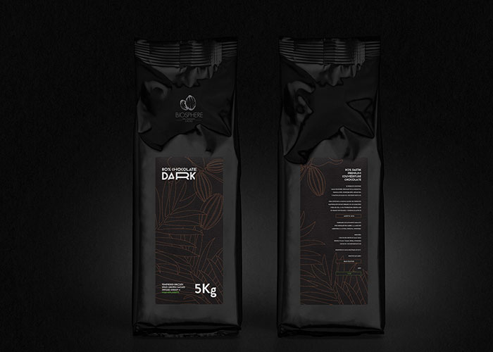
Design: Michal Slovák / Customer: Biosphere – Fine Honduran Cacao / Country: Slovakia
The designer Michal Slovák was inspired by the nocturnal atmosphere of the rain forest where one of the few types of cocoa that does not come from plantations grows, used in making Biosphere’s covering. Also, the use of black in the design is a clear allusion to the high percentage of cocoa in the chocolate, which is 80%.
4. Take-away set products
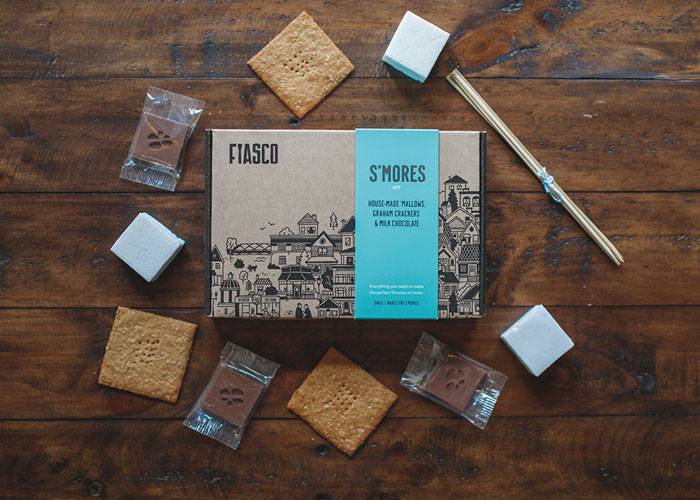
Design Marc Rimmer / Customer: Fiasco Gelato / Country: Canada
The ice cream shop in Calgary (Canada), Fiasco Gelato, proposes the original S’mores Kit with a selection of products to take away. The packaging, made by the designer Marc Rimmer, contains grahams crackers, chocolate with milk and coconut, vanilla pods marshmallows, and toasted bamboo sticks.
5. Escribà’s extravagance in the heart of design
Designer: Orange bcn / Customer: Pastelerias Escribà / Country: Spain
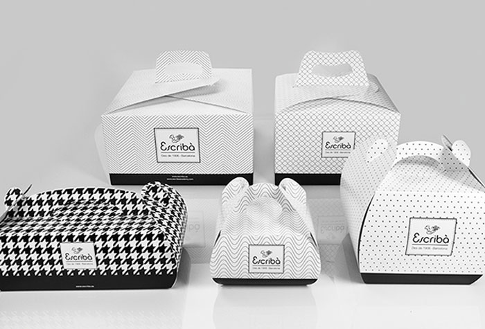
The firm from Barcelona, Orange bcn is responsible for the new corporate image of Christian Escribà’s shop. A design based on very minimalistic graphic prints, improvements in the quality of the cardboard packaging, and the incorporation of the color black as the protagonist of Escribà’s new label.
6. Melted chocolate, Eat Chocolates’s visual identity
Designer: Pedro Paulino / Customer: Eat Chocolates Artesanais / Country: Brazil
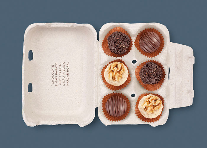
From São Paulo, Pedro Paulino designed a range of different packages that revolve around a visual identity based on a drop of melted chocolate. Egg cups, wooden boxes, candy cases, bonbons that look like boxes in which cigars or fountain pens are kept, are some of the packaging created for Eat Chocolates Artesanais.
7. Stationery and printing, elements of design
Designer: Shed Brand Innovation / Customer: Wicked & Wonderful Chocolate / Country: England
Stationery and printing paper as elements of these stylish cases are strategic partners in a line of chocolate bars with refined craftsmanship with lavender or chili, among other ingredients.
